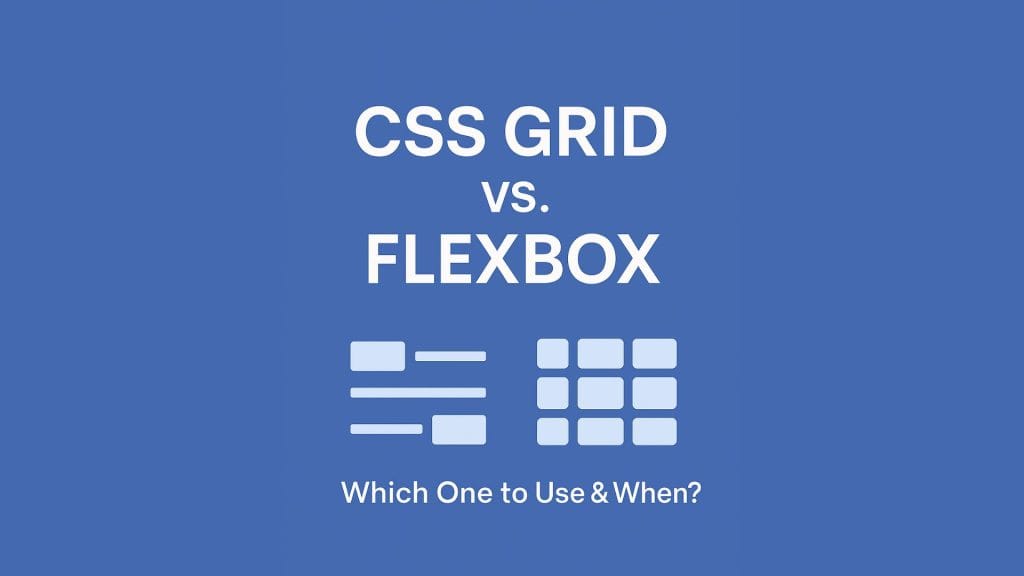
CSS Grid vs. Flexbox: Which One Should You Use & When?
In the modern world of responsive web design, two layout models dominate: CSS Grid and Flexbox. While both are powerful tools for structuring layouts, understanding when to use CSS Grid versus Flexbox can save you time, reduce code complexity, and enhance user experience.
Let’s break down the differences, use cases, pros, and cons of each so that you can choose the right tool for your next web project.
What Is Flexbox?
Flexbox, or the Flexible Box Layout, is a one-dimensional layout model. It allows you to align items in a row or a column, making it ideal for laying out elements in a single direction.
🔧 Common Use Cases for Flexbox:
- Navigation bars
- Buttons in a row
- Horizontal/vertical centering
- Aligning form elements
- Dynamic resizing of elements
✅ Flexbox Pros:
- Great for small-scale layouts
- Easier to learn and implement
- Perfect for aligning content inside containers
❌ Flexbox Cons:
- Not ideal for complex, two-dimensional layouts (rows + columns)
- Harder to manage grid-like structures
What Is CSS Grid?
CSS Grid is a two-dimensional layout system. It enables you to manage both rows and columns simultaneously, providing greater control over complex designs.
🔧 Common Use Cases for CSS Grid:
- Full-page layouts
- Complex UI components
- Dashboards or galleries
- Asymmetrical and responsive grids
✅ CSS Grid Pros:
- Best for large-scale layouts
- Explicit row and column control
- Simplifies complex designs without extra markup
❌ CSS Grid Cons:
- Slightly steeper learning curve
- Not always ideal for simple, linear layouts
CSS Grid vs. Flexbox: Key Differences
| Feature | Flexbox | CSS Grid |
| Layout Direction | One-dimensional (row or column) | Two-dimensional (rows and columns) |
| Content vs. Container | Content-first | Container-first |
| Complexity | Simple | Ideal for complex layouts |
| Browser Support | Excellent | Excellent (modern browsers) |
| Learning Curve | Easy | Moderate |
When to Use Flexbox
Use Flexbox when:
- You’re aligning items along a single axis (horizontal or vertical).
- You want flexible item resizing or equal spacing.
- You’re building components like navigation menus, cards, or forms.
Example:
.container {
  display: flex;
  justify-content: space-between;
  align-items: center;
}
When to Use CSS Grid
Use CSS Grid when:
- You’re building a layout with both rows and columns.
- You want precise control over alignment and placement.
- You’re creating responsive grid-based sections.
Example:
.container {
  display: grid;
  grid-template-columns: repeat(3, 1fr);
  grid-template-rows: auto;
}
Can You Use Both Together?
Absolutely! In real-world projects, it’s common to use CSS Grid for layout structure and Flexbox for component alignment inside grid areas. Combining them gives you the best of both worlds.
Final Thoughts: CSS Grid vs. Flexbox
There’s no winner-takes-all between CSS Grid and Flexbox. It all comes down to the layout complexity and design goals of your project.
- Use Flexbox for smaller, linear components.
- Use CSS Grid for full-page or complex layouts.
By mastering both, you’ll be able to handle any web layout challenge with ease.
Want to learn more CSS layout tips?
Stay tuned to our blog for hands-on tutorials, layout hacks, and performance optimization strategies!